Posts

Final Portfolio

Image
  Artistic Statement Even though this was the longest project I have ever done the entire semester, I really enjoyed it. I mainly focused on three colors: yellow, blue and pink. Yellow is for the Adobe Illustrator, blue is for Adobe Photoshop and pink is for Adobe InDesign. I used some different shades in different pages to make it look more colorful and creative.  While I struggled a lot throughout the semester because I have never used any of those software before or had any knowledge in art and design, this class helped me with all of these. I believe I have strong foundation in all of those software, and I got better with design than I used to a long time ago. I will gladly maintain all what I learned and learn even more in the future. Not only because I enjoyed the process of learning new things but I also because I believe it is beneficial to know those graphic designs and software skills. Finally, it's because I liked and I got more interested in it..

Business Cards

Image
 Sketches: Final Project: Artistic Statement: I find this project really interesting. I think it is an important one too for people who want to own a business or just for any employment reasons. For me, the last one is my favorite because I love how the color purple and extremely light blue combined beautifully together and the gradient as well. They fit the logo too. I like the first one too. I mainly used the rectangle frame tool to color the background and to put my logo.  

Postcard

Image
  Artistic Statement: I made a travel postcard about my country, Egypt. I enjoyed doing this project. It took me about an hour and a half. I mainly used the frame rectangle tool to place the pictures. I would click on buttons like fit content proportionally and fit content to frame for adjustment. I put some lines using the line shape tool for the stamp or the signature or just for the writing in general. I added some effects such as shadows on the text and around the tagbrush.

Animation

Image
 Project: I had to redo this project because the first one did not work out. I was kind of nervous about this project, but when I watched some parts of the tutorial videos and just went ahead and gave it a try, I found it to be easy. I was trying to make that animation kind of related to my country, Egypt. In the beginning, I was trying to put and animate the pyramids instead of the camel but it was difficult because the pyramids are next to each other in almost all pictures. It would have been easier and better if each one was separated or far away, but I still decided to stick to something related to Egypt, so I picked this cute animated camel and some random desert landscape. You can also see my tag brush at the top.

InDesign Homework

First Tutorial  https://www.youtube.com/watch?v=0eqhUFRlvgI The video was easy to understand and the creator is a great explainer. I find the 'create guides' interesting so you don't have to use lines to make that. Also, you can right-click on either 'fit the frame proportionally' or 'fit the content proportionally' instead of having to go to the right side. It is quicker. I believe there is no hard tool since we covered many of them in class Second Tutorial https://www.youtube.com/watch?v=wF_fu1wcT0Y This video is great too. Before he did anything, he showed us around and give us a brief introduction of what each side too. On the right side, when we click on pages, we can click the plus button so they can be two pages next to each other. If you could not find layers or anything on the right side, you can go to the windows button at the top to activate that.  Third Tutorial  https://www.youtube.com/watch?v=2WHp9anxS1I This one I would say very detailed. I be

Somewhere

Image
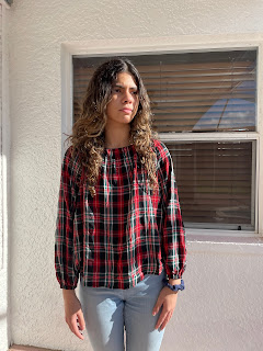
 Original Image: TV SHOW: Final Image: Artistic Statement: This was the most fun project I have done so far. It only took me an hour and thirty minutes. I picked stranger things because it is my favorite show. I loved this scene because this is the part where Eleven gets all her power back. I basically selected ' Select Mask' then I used the quick selection tool to highlight my figure as the part I want to keep. Then, I clicked on the brush with the minus sign so I can remove the background and any unwanted parts. Then, I went to adjust the brightness and contrast to make my picture's light and shade as close as possible to the movie picture. I also flipped the picture as the sunlight was coming from the left side. Finally, I posed this picture as if I were observing and looking around in the desert just like Eleven is doing here. 

Photoshop Homework 3

Image
 1. This picture will be complicated to edit or photoshop because it is already edited. I mean the speed and the light reflection coming out of Kirby. 2. This picture gives me the somewhere idea I picked it because I would really like to visit Hollywood or California one day. It is also the heart of the film industry and I would love to build my career there one day. 3. This one really made me laugh especially the second one. I just find it funny how she continued smiling while or after dropping him. 4. As someone who likes to try different photoshoot ideas. I really like the idea of this one. I believe it will be also easy to recreate